التحديChallenge
آي فارما كير ليست صيدلية واحدة: فرعان في جدة، ومستودع، وذراع بيع بالجملة تُورّد لصيدليات أخرى. وطلبوا شيئاً يناقض نفسه ظاهرياً: أن تُعرف صيدليةً من النظرة الأولى، وألّا تشبه أيّ صيدلية. الصيدليات تتشابه لأنها تستعير الرموز نفسها — الصليب، الكوب، الأفعى — وتضعها بجانب الاسم، ومحاولة التميّز تنتهي عادةً برمز مجرّد لا يدلّ على القطاع أصلاً.i Pharma Care is not a single pharmacy: two retail branches in Jeddah, a warehouse, and a B2B arm that supplies other pharmacies. The brief contradicted itself — read as a pharmacy at a glance, and look like no other pharmacy. Pharmacies look alike because they borrow the same symbols — the cross, the cup, the serpent — and set them beside the name; any attempt to stand out usually ends in an abstract mark that no longer says pharmacy at all.
القرارDecision
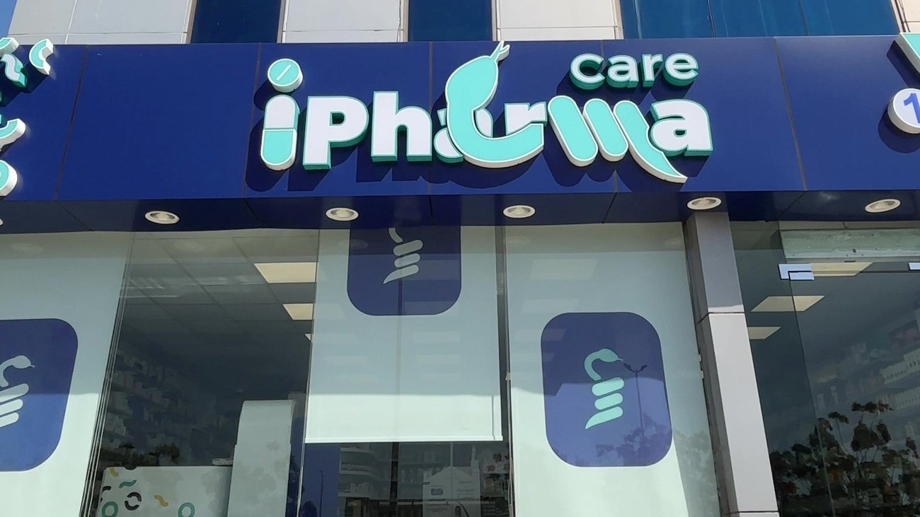
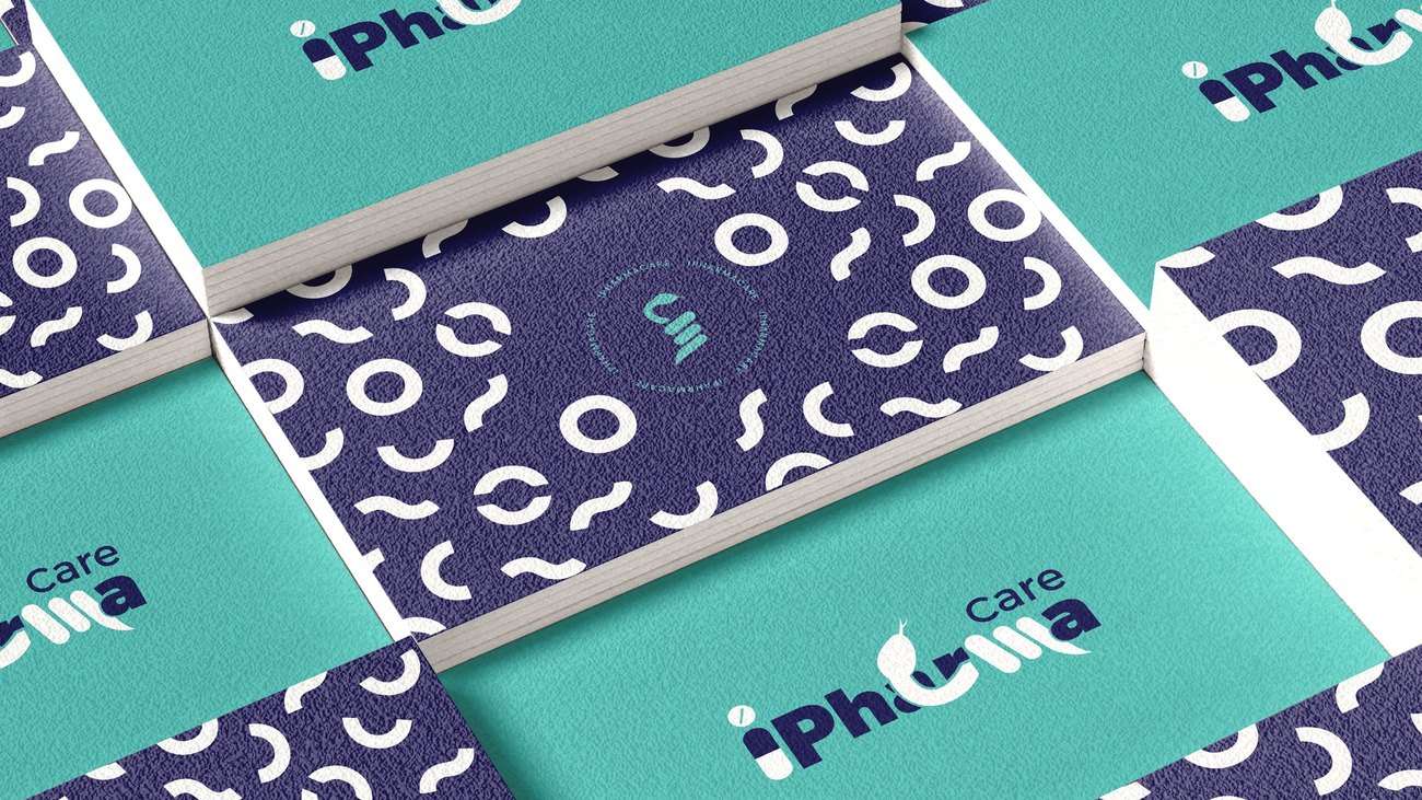
قدّمت ثلاثة اتجاهات. الذي اختاروه لم يضع الرمز بجانب الاسم بل بداخله: نقطة الـi حبّة دواء، والأفعى تمرّ داخل الحروف حتى صارت جزءاً من الكلمة لا ملحقاً بها. ونظام لوني قائم على الكحلي العميق للثقة الطبية والتركوازي لكسر جمود القطاع.I presented three directions. The chosen one places the symbol inside the name, not beside it: the dot of the i is a pill, and the serpent runs through the letterforms until it belongs to the word rather than hanging off it. The colour system pairs deep navy for medical trust with turquoise to break the sector's rigidity.
النتيجةResult
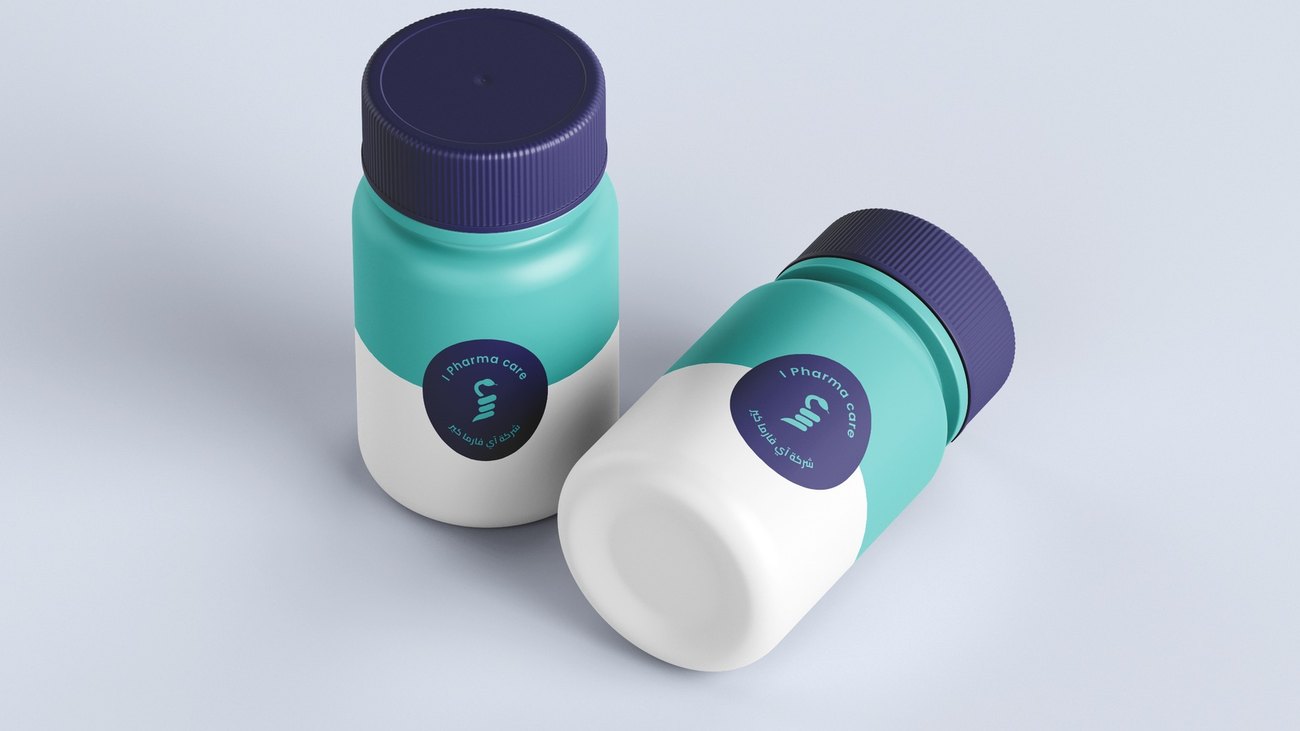
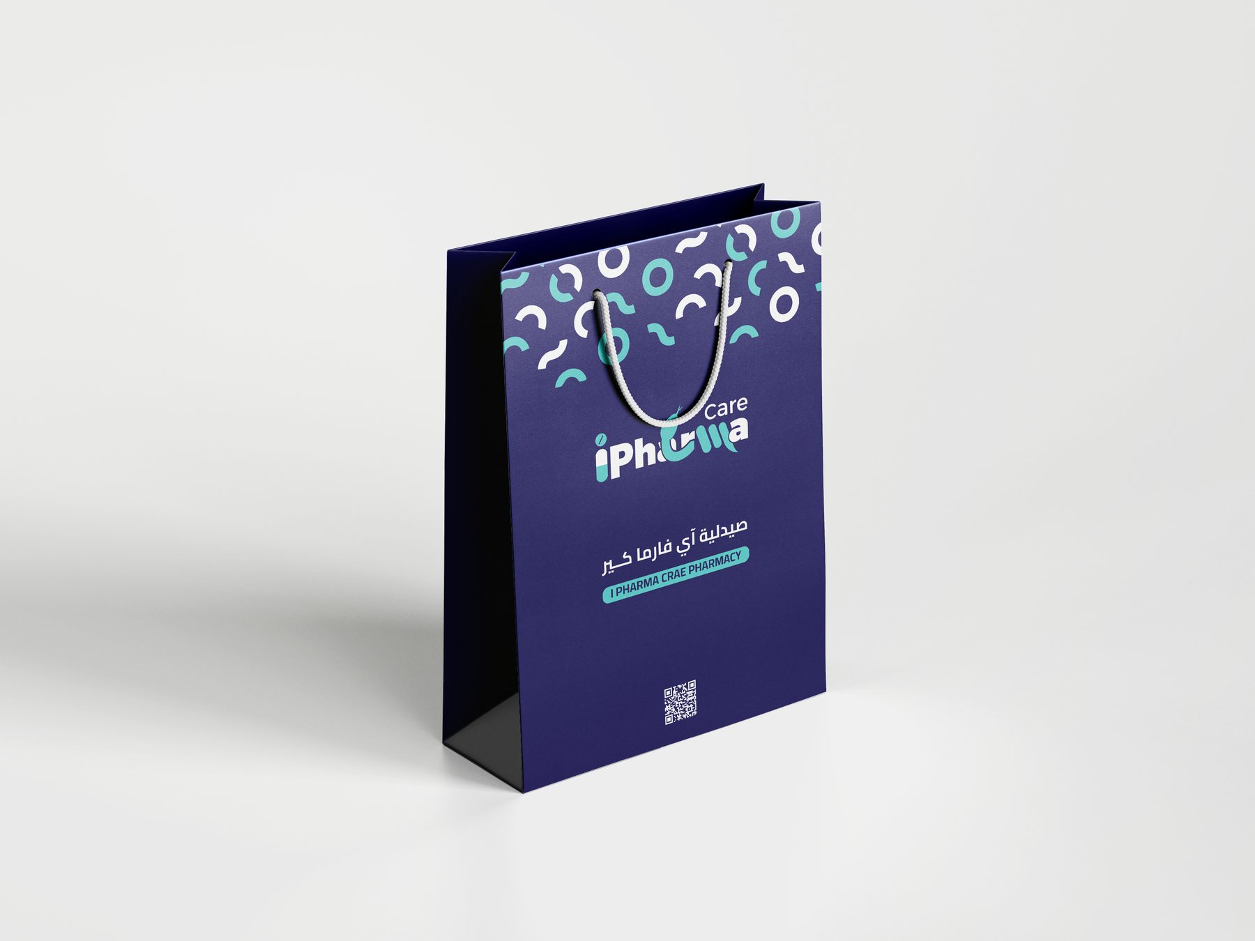
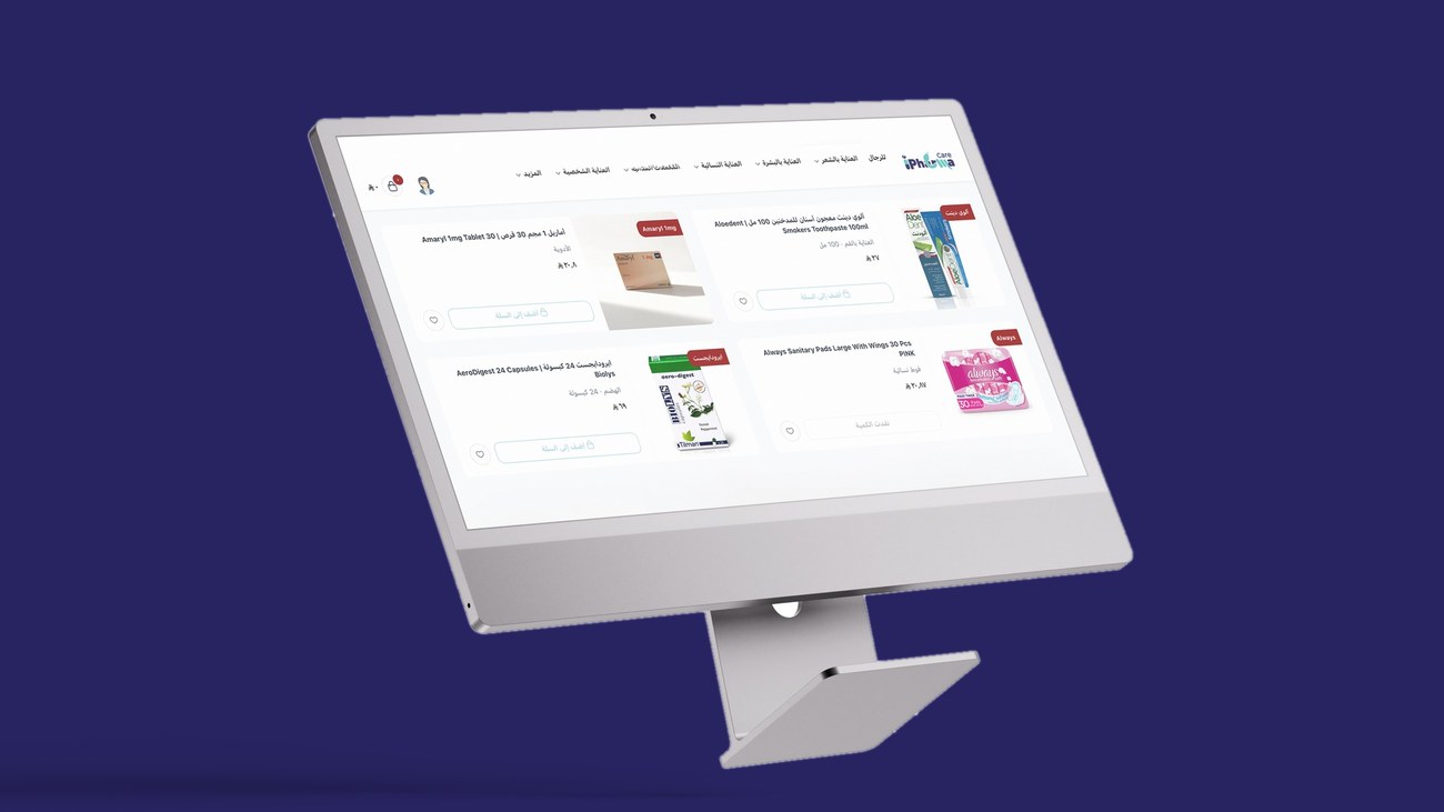
من هذه النقطة بُني النظام كاملاً — نمط، ألوان، مطبوعات، تغليف، ومواد رقمية. ولأن العلامة تبيع للمستهلك وللصيدليات في آن، كان عليه أن يصمد على رفّ، وعلى صندوق توصيل، وعلى شاشة. واليوم الهوية قائمة على الواجهة، وعلى متجرَي سلة وترنديول وحسابات التواصل.From that single move the whole system followed — pattern, colour, print, packaging and digital. Because the brand sells to shoppers and to pharmacies at the same time, it had to hold on a shelf, on a delivery box and on a screen. Today the identity stands on the storefront and across the brand's Salla and Trendyol stores and social channels.